The ask
Rondo Media asked for a new brand for Rownd a Rownd, the S4C drama that has run since 1995. It had to bring in a younger audience without losing the viewers who grew up with it, and it had to work as a title sequence, on social media and on every platform the show now lives on.
The idea
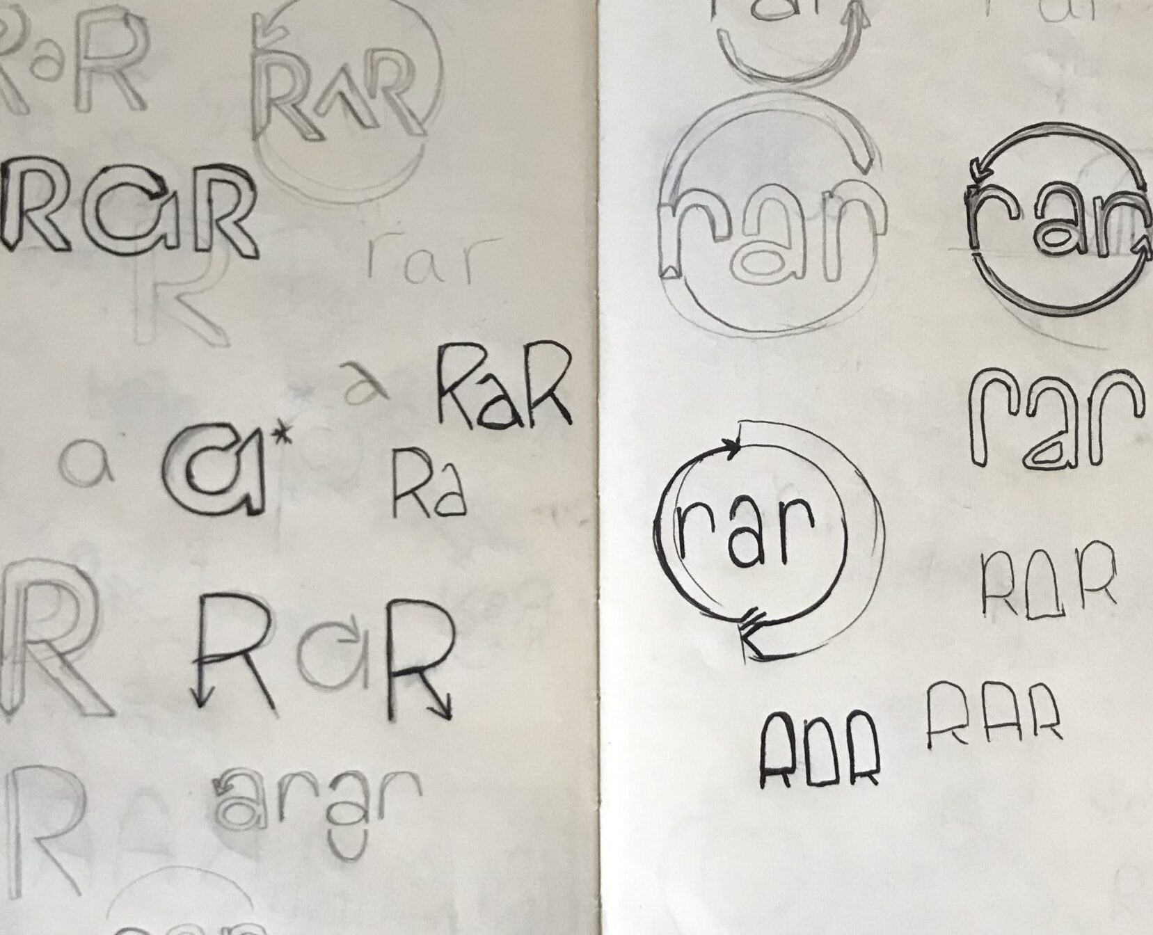
We went back to the archive and found the 1995 logo. Its shapes became the starting point for a shorter, sharper mark: RaR. Negative space in the letterforms forms subtle arrowheads, so the logo carries direction even when it is standing still. The arcing, semi-circular shapes around it were drawn to move first and sit still second.


The system in motion
The identity shipped as a full kit: opening titles, colour palette, social icons and a set of adaptable social assets that keep the same energy at every size.